A Reminder to Appreciate the Present
For Week 4 of my weekly card challenge, I chose the theme “Cherish It.” As we settle into autumn, the season reminds us how quickly time passes and how important it is to appreciate the beauty that surrounds us right now. The sentiment can mean cherish the season, cherish life, or simply cherish everything you have at this moment. I love that its meaning is open and personal, making this card suitable for almost anyone.

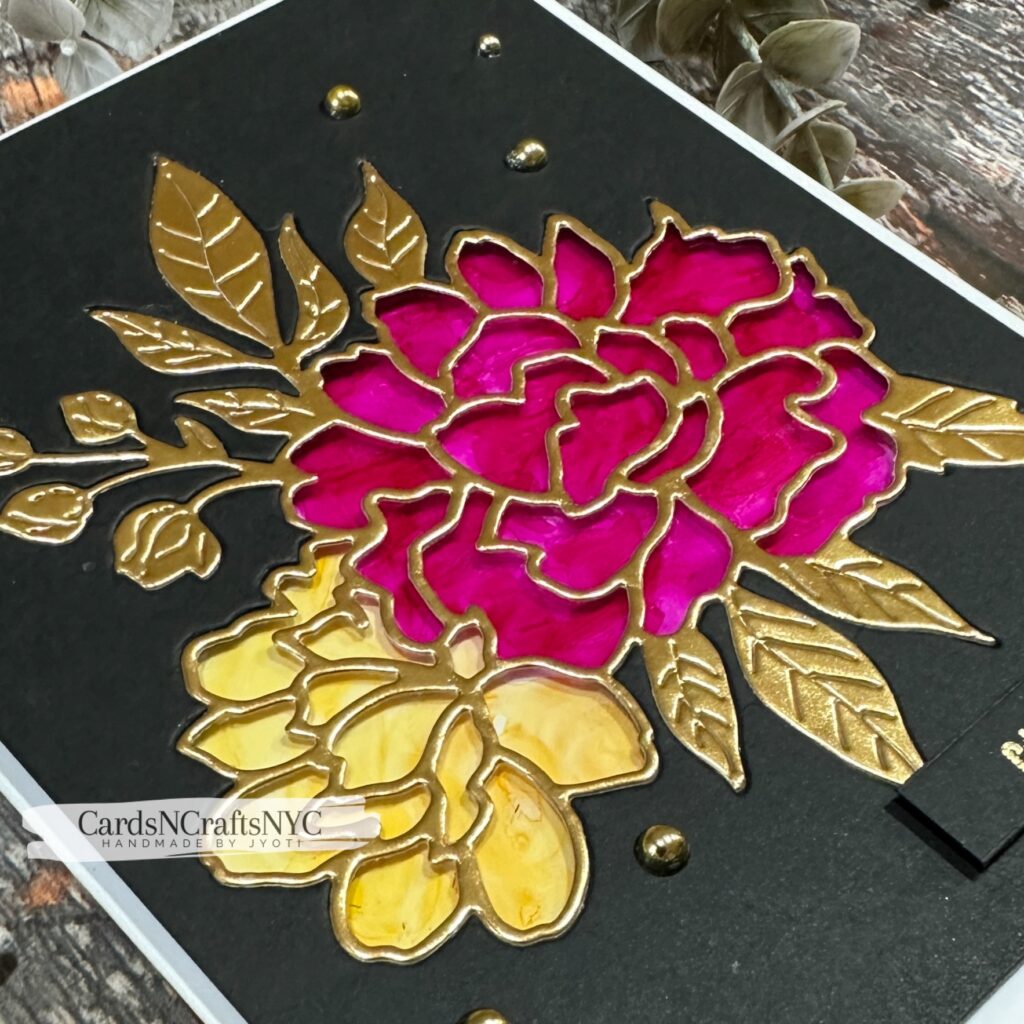
For my earlier weekly challenges, I explored different ideas and techniques while creating with supplies already in my craft room. This week, I wanted to give a familiar floral die a completely different appearance. Instead of assembling the flowers from traditional cardstock layers, I used acetate and alcohol markers to create a luminous stained-glass effect.
Creating the Floral Window
I used the Peony Celebration Die Set from Spellbinders to cut the floral design directly from a charcoal cardstock panel. Although this particular set has been discontinued, Spellbinders and other companies have released many similar floral outline dies that would work beautifully with this technique.
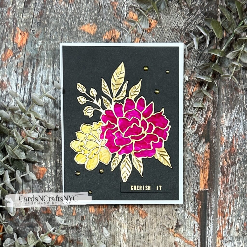
After cutting the design, I adhered a piece of acetate behind the opening. The deep charcoal panel frames the transparent flowers and creates a dramatic background that allows the bright colors and metallic details to stand out.
Coloring the Acetate
I colored the acetate with Copic markers, using RV69 Peony for the rich pink flower and Y38 Honey for the golden-yellow flower. Coloring on acetate gives the petals a translucent appearance, allowing light to pass through the color much like stained glass.
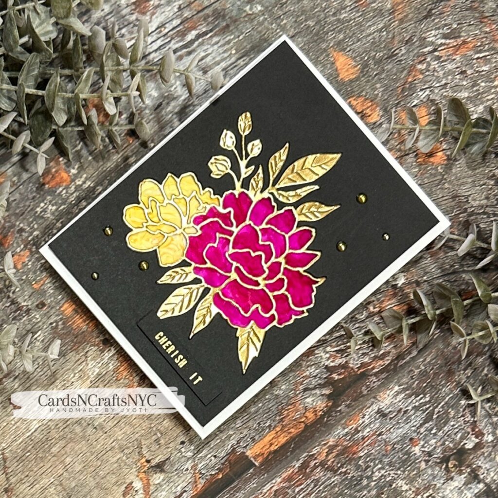
This was the new technique I wanted to explore for Week 4. The vivid pink and warm honey tones bring energy and warmth to the dark background, while the transparent surface gives the flowers a beautiful glow. Any alcohol markers could be used to recreate this effect in a favorite seasonal color palette.
Adding the Gold Outline
To define the flowers and leaves, I die-cut the coordinating outline from gold cardstock and carefully adhered it over the colored acetate. The gold separates each section of color and completes the stained-glass appearance.
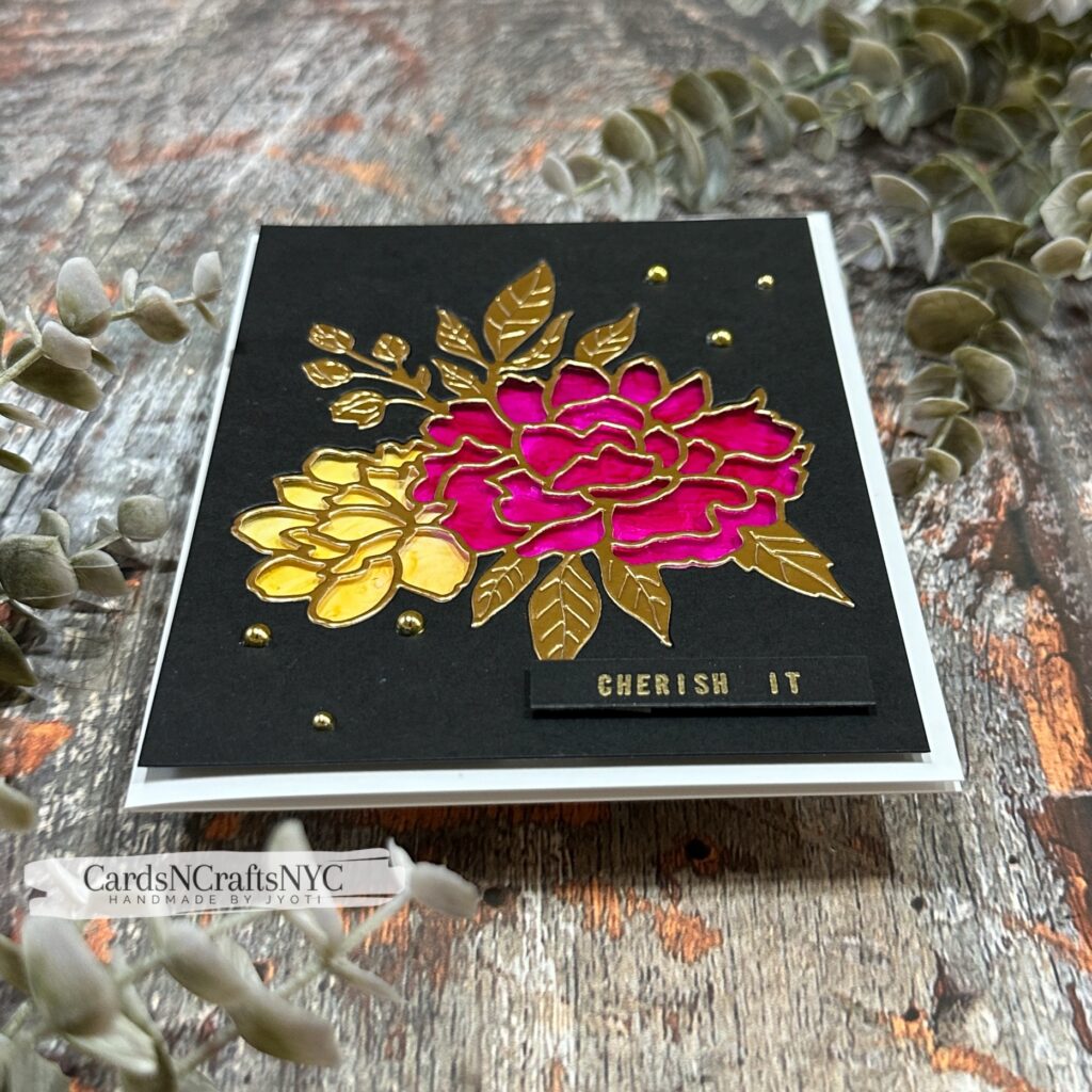
I especially love the contrast between the bold floral colors, reflective gold outline, and charcoal background. The dark panel represents the quieter transition into the new season, while the glowing flowers serve as a reminder to notice and cherish the bright moments within it.
A Meaningful Custom Sentiment
For the sentiment, I used my Trodat custom stamp to create the words “Cherish It.” Although it is a short sentiment, it can carry many meanings. It might encourage someone to cherish the season, a special experience, the people they love, or the life they are living right now.
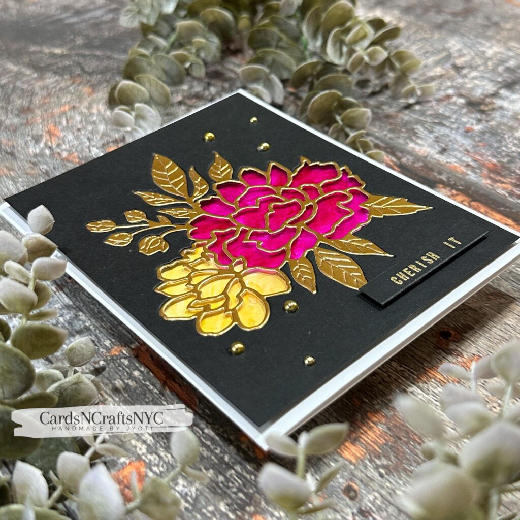
I stamped the sentiment on a small strip of matching charcoal cardstock and added it near the bottom of the card. Keeping the sentiment simple allows the colorful floral design to remain the main focus while still giving the card a thoughtful message.
Finishing the Card
To finish the design, I scattered a few gold pearls around the floral arrangement. They echo the metallic outline and add just enough dimension and shine without distracting from the stained-glass flowers.
This Week 4 card is about more than trying a new way to use acetate and alcohol markers. It is a reminder to slow down and cherish what is in front of us, because seasons change and moments pass so quickly. I hope this design inspires you to look at your floral dies in a new way and create something meaningful with supplies you already have. If you try a similar technique, I would love for you to tag me on social media so I can see what you create.
Hugs,
Jyoti