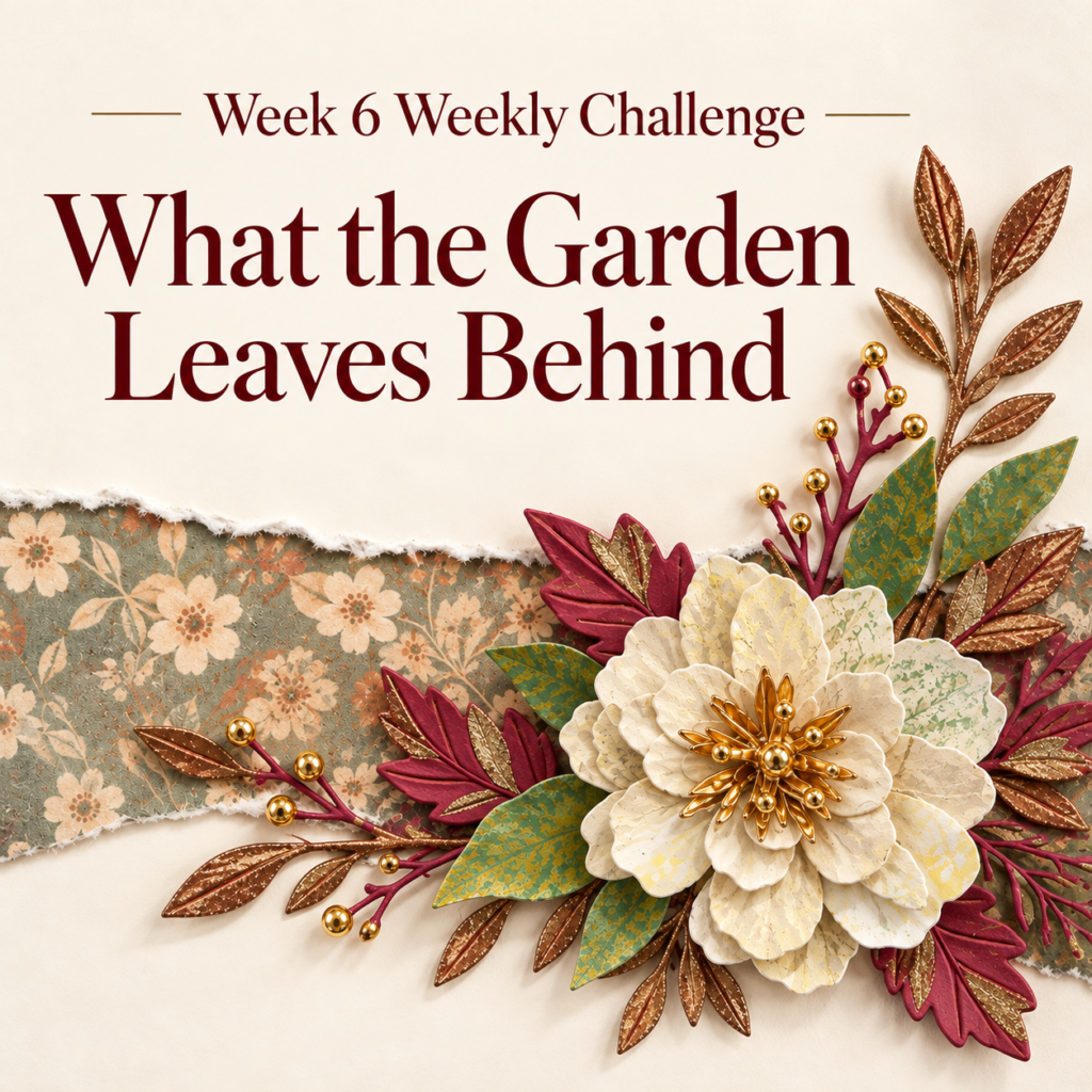
As the season changes, the drying leaves and petals in my garden have been catching my attention. Their colors soften, their edges curl, and the delicate veins become part of their character. For Week 6 of my weekly cardmaking challenge, I wanted to bring those details onto paper. My theme, “What the Garden Leaves Behind,” celebrates the textures and impressions that remain as the garden moves past its flowering season.
Capturing Nature’s Impressions
This week’s technique was botanical gel printing. I pressed real leaves and flowers onto a gel plate, experimenting with ways to capture their natural vein patterns and transfer that texture onto paper. Rather than creating a smooth, evenly colored surface, I wanted the prints to have variations that would help my paper flowers and foliage resemble dried botanicals.
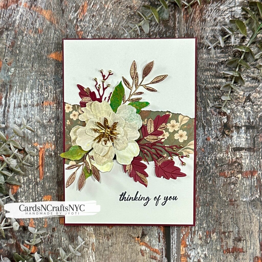
This was my first attempt at the technique, and it was very much a learning experience! Some impressions were more visible than others, but those unpredictable results were part of the appeal. I’m sure I’ll gain more control as I get familiar with the process. For now, I enjoyed discovering how something gathered from the garden could leave its own mark on my cardmaking.
A Peony with a Dried Petal Look
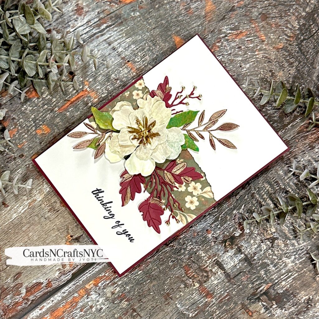
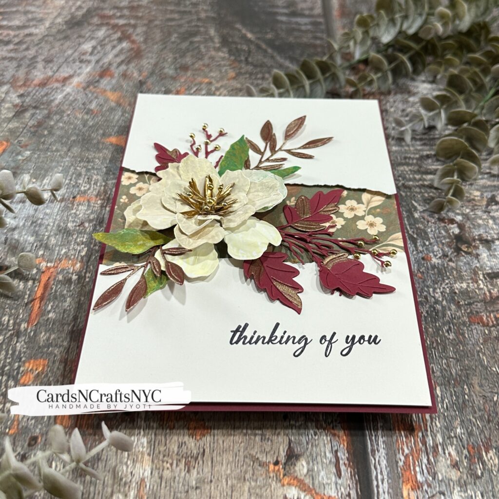
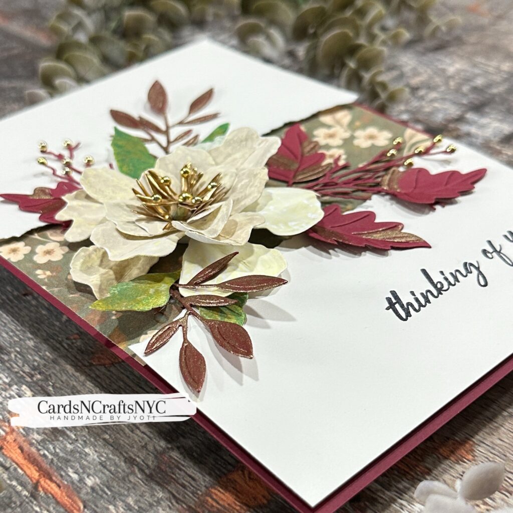
For the focal flower, I used the Spellbinders Double and Single Peonies dies designed by Susan Tierney. The softly colored printed paper gave the petals subtle variations in cream, pale yellow, and hints of green. The botanical impressions added texture that helped me work toward the dried flower look I had imagined.
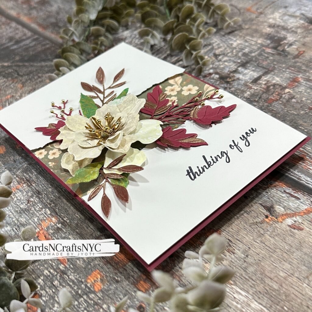
Layering and shaping the petals brought the peony to life while keeping that softened, slightly weathered appearance. I love how the large bloom draws attention to the details in the paper. A gold center adds warmth and a little shine against the delicate petals.
Gathering the Autumn Foliage
I paired the peony with foliage cut using various Spellbinders dies, combining botanical prints with deep rose and warm metallic tones. The green printed leaves introduce a trace of the garden’s remaining color, while the rose foliage gives the arrangement a richer autumn feel.
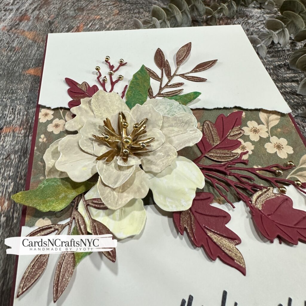
I arranged the leaves and branches around the flower so they extend in different directions, creating movement across the card. Small gold accents on the branching stems echo the flower center and bring the different elements together.
A Floral Backdrop
A strip of muted floral patterned paper sits behind the arrangement, with torn edges adding to the aged botanical feel. Its soft colors complement the peony and foliage without competing with the dimensional flower.
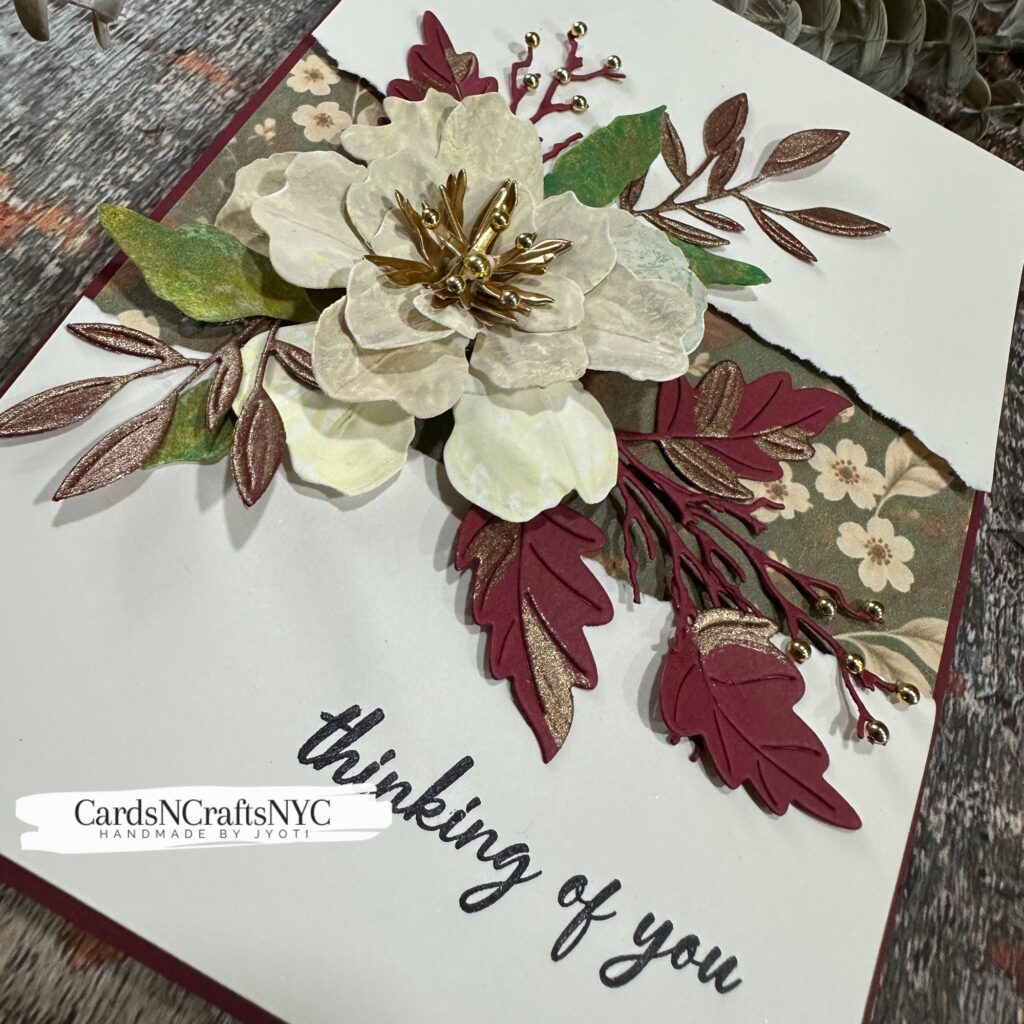
I kept the surrounding panel light and open so the printed textures would have room to stand out. A narrow deep rose border frames the card and repeats the color of the foliage, making the whole arrangement feel connected.
A Thoughtful Finishing Touch
The simple “thinking of you” sentiment makes this card suitable for sending a little comfort or letting someone know they are on your mind. Placed beneath the floral arrangement, it leaves the peony as the focal point while giving the card a warm, personal purpose.
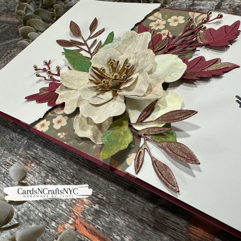
There is something meaningful about using impressions from my own garden to create a card for someone else. The leaves and petals become more than inspiration—they contribute their textures to the finished piece.
Keep Exploring
Week 6 reminded me that a first attempt doesn’t have to be perfect to become something worth sharing. I set out to capture the look of drying flowers and leaves, and this experiment gave me a new way to bring their details into my paper crafting. I’m looking forward to trying botanical gel printing again and seeing what other impressions the garden has to offer.
If this project inspires you, try making a print with a leaf or flower and use it in your own creation. I’d love to see what you make. Tag me on social media so we can share the discoveries along the way!
Hugs,
Jyoti