Autumn, with its crisp air and vibrant hues, is a season that ignites creativity. In this blog post, I’m thrilled to share the stories of three cards, each a testament to the beauty of fall, made possible through Spellbinders’ BETTERPPRESS FALL COLLECTION. As I immersed myself in the art of impressions, watercolors, and embellishments, I discovered the true essence of autumn crafting. Join me on this colorful journey through the world of BetterPress!
Mushroom Magic
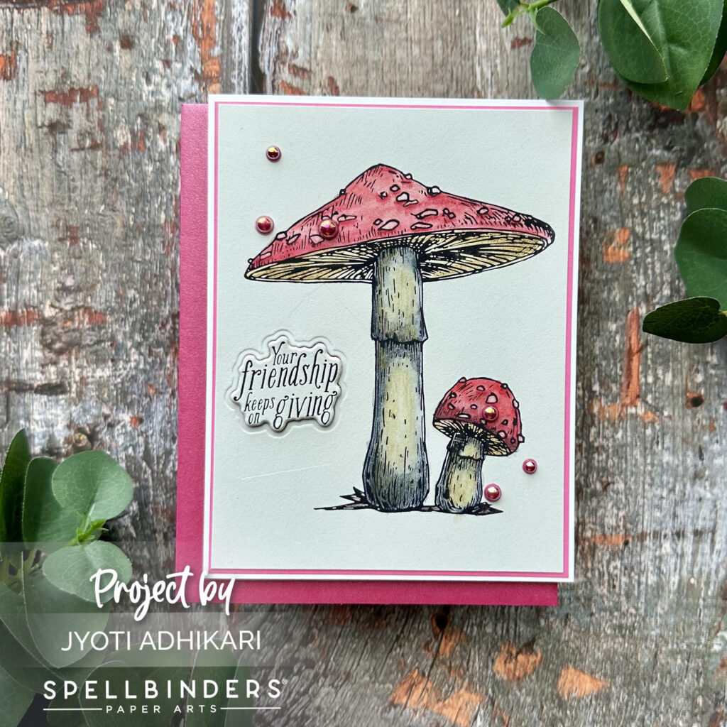
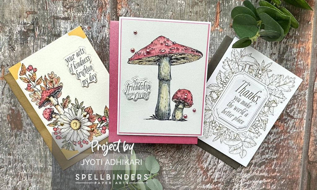
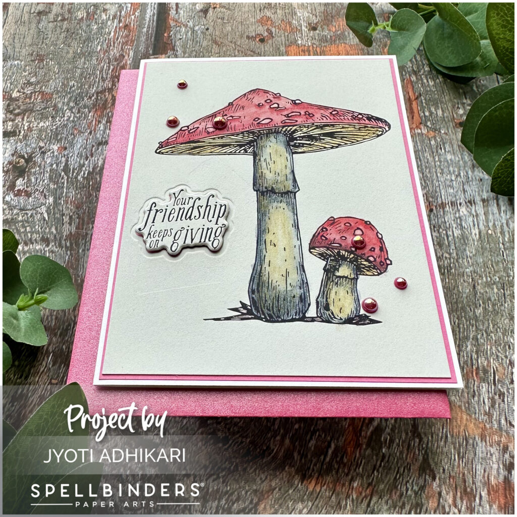
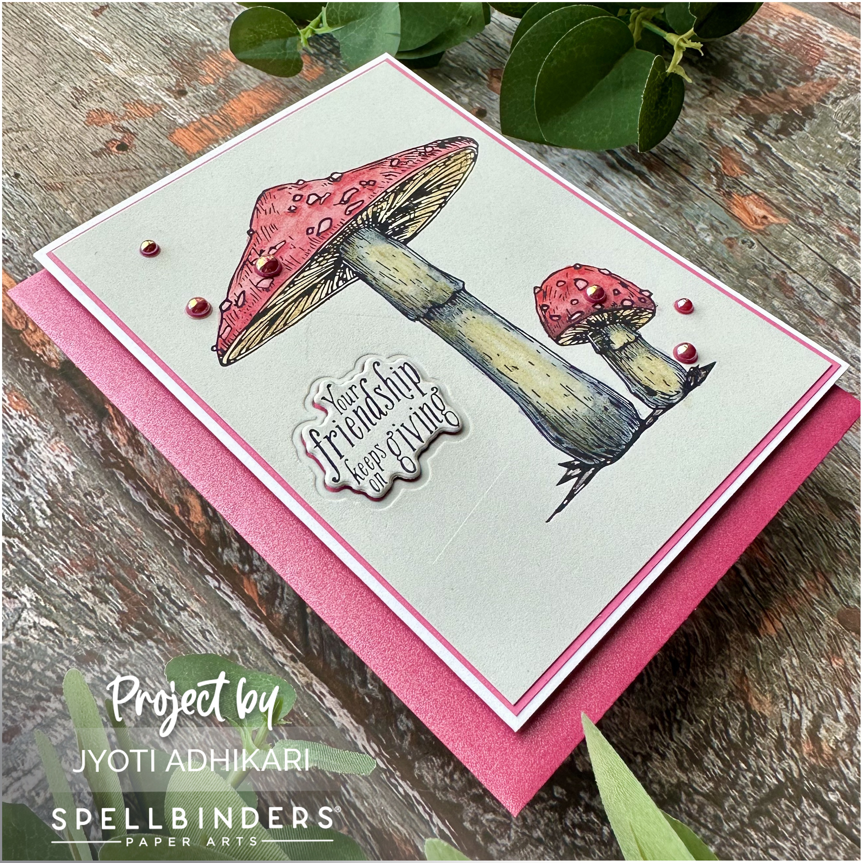
The first card in this autumn trio showcases the MUSHROOM DUO PRESS PLATE AND DIE SET from BETTERPPRESS FALL COLLECTION. I started with a PEBBLE BETTERPRESS A2 COTON CARD PANEL and black ink, setting the stage for enchanting mushrooms. My favorite coloring method came into play – Inktense pencils and just a touch of water.
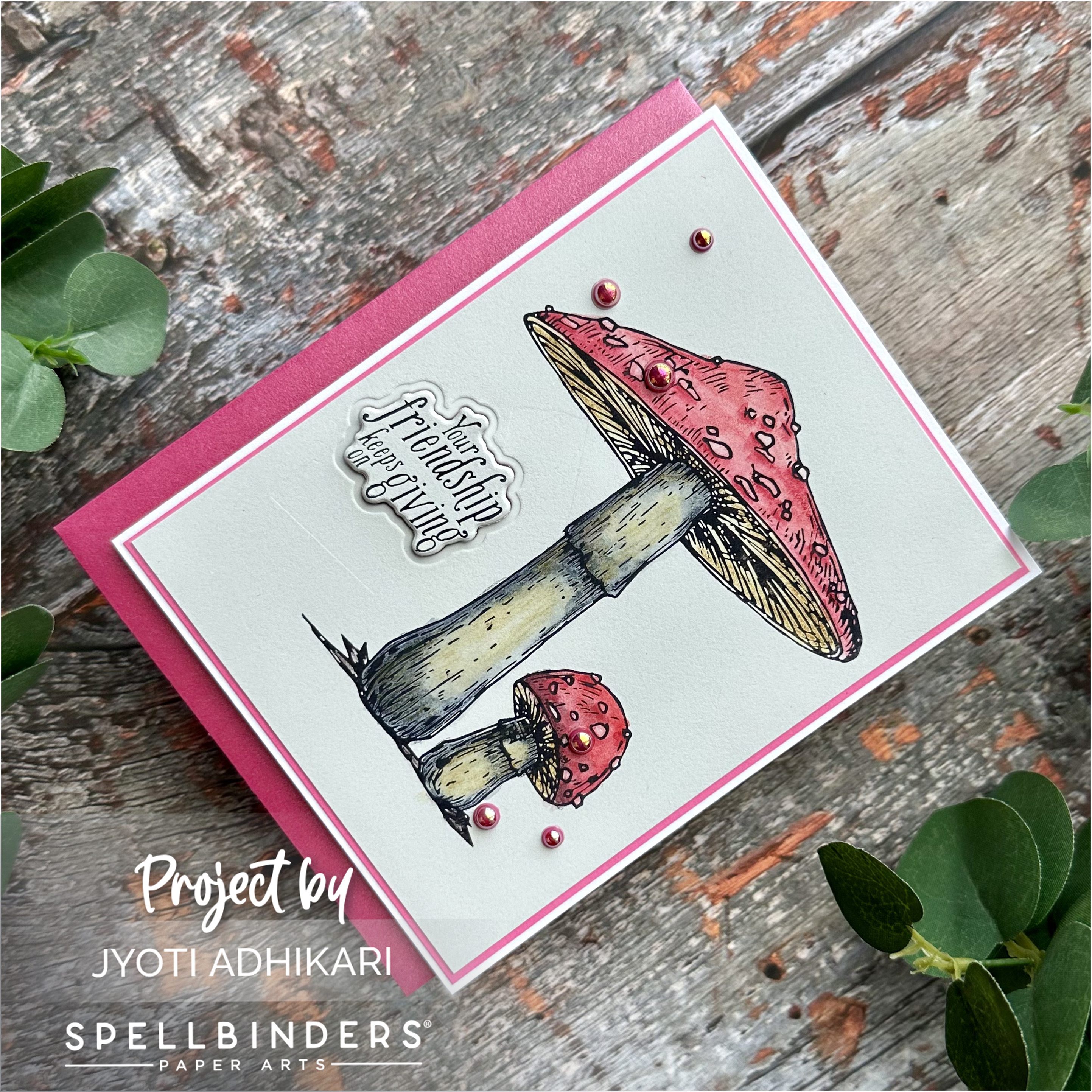
Once the coloring was done on the letterpress prints, I used the provided die to cut out the sentiment. Adding a layer of pink card-stock that perfectly complemented the mushrooms, I mounted it onto a white card base. The gray and pink combination was a visual treat. I then embellished my card with Studio Katia Hibiscus Pearls. This finished my first card.
Autumn’s Floral Embrace
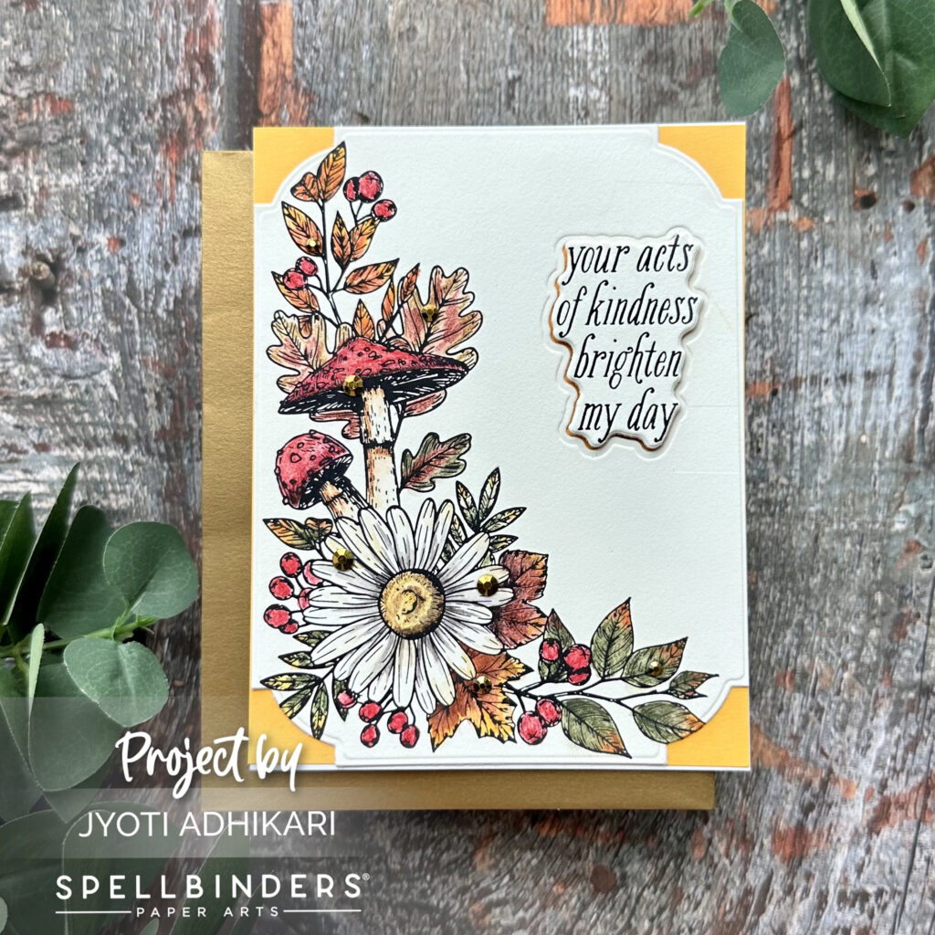
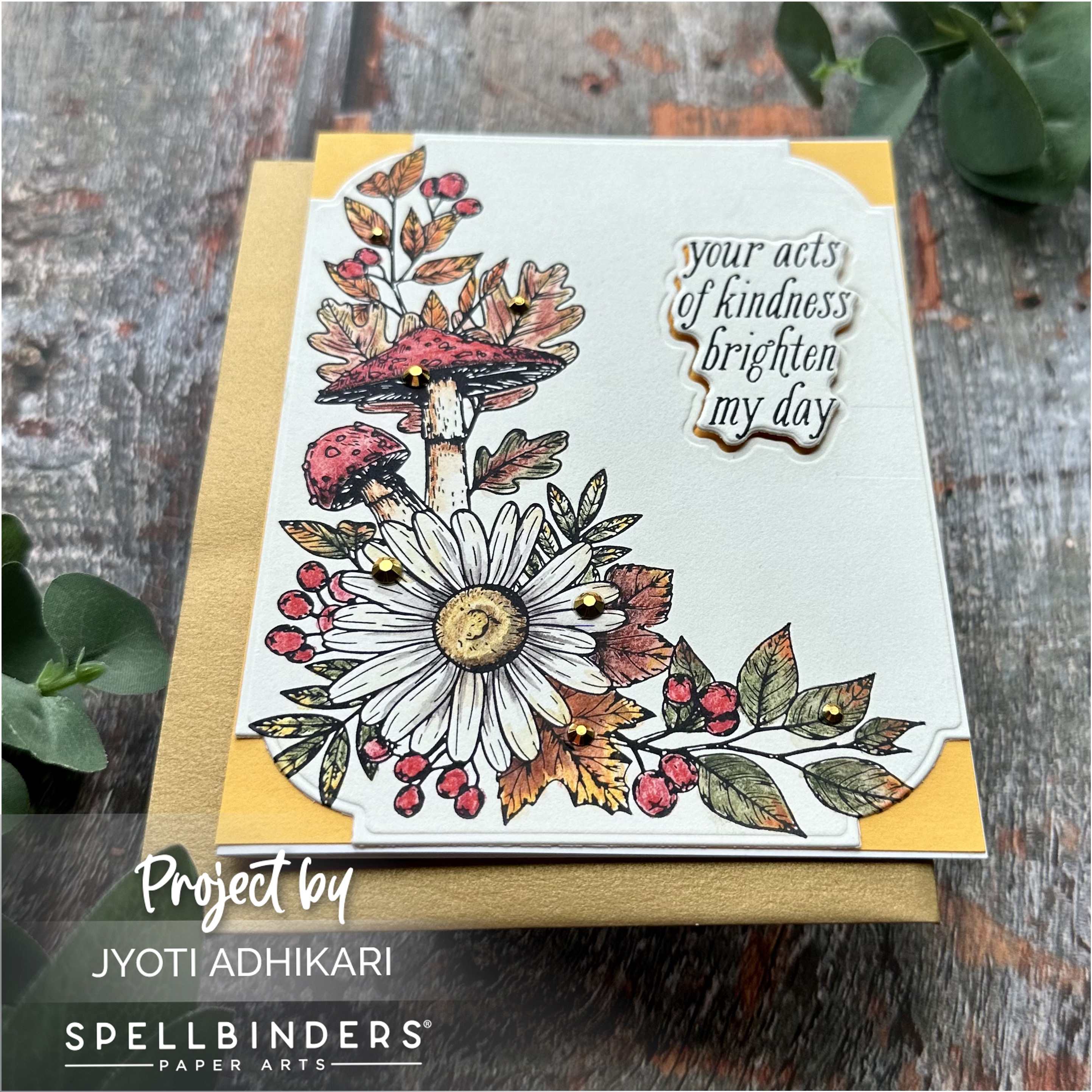
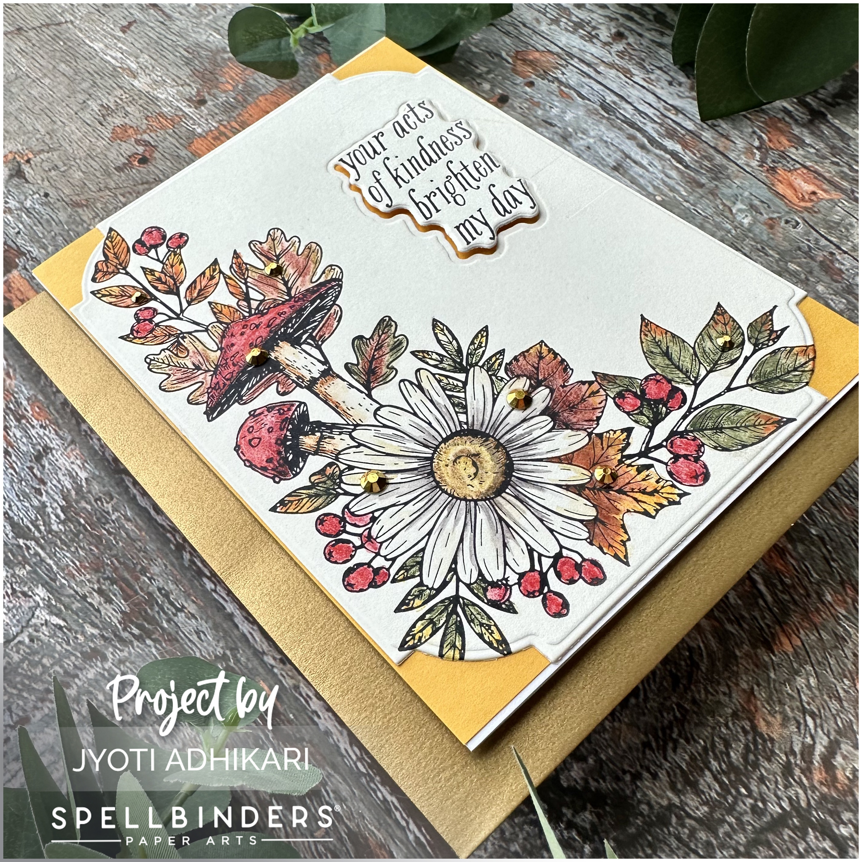
The second card exudes the charm of autumn florals with the AUTUMN FLOWER CORNER PRESS PLATE AND DIE SET. Using a BISQUE BETTERPRESS A2 COTTON PANEL and black ink, I created a perfect letterpress image. Yellows, oranges, and yellow-greens brought the image to life, thanks to Inktense pencils and gentle water blending.
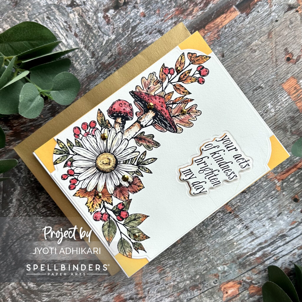
To add a touch of elegance, I used the NOTCHED CORNER FRAMES ETCHED DIES to frame the panel, mating it with yellow cardstock. The sentiment, also die-cut from die that’s in the set, added for dimension with foam tape found it’s place in the right top corner. And of course, what’s fall without a touch of gold? Studio Katia Gold Crystals adorned this card beautifully.
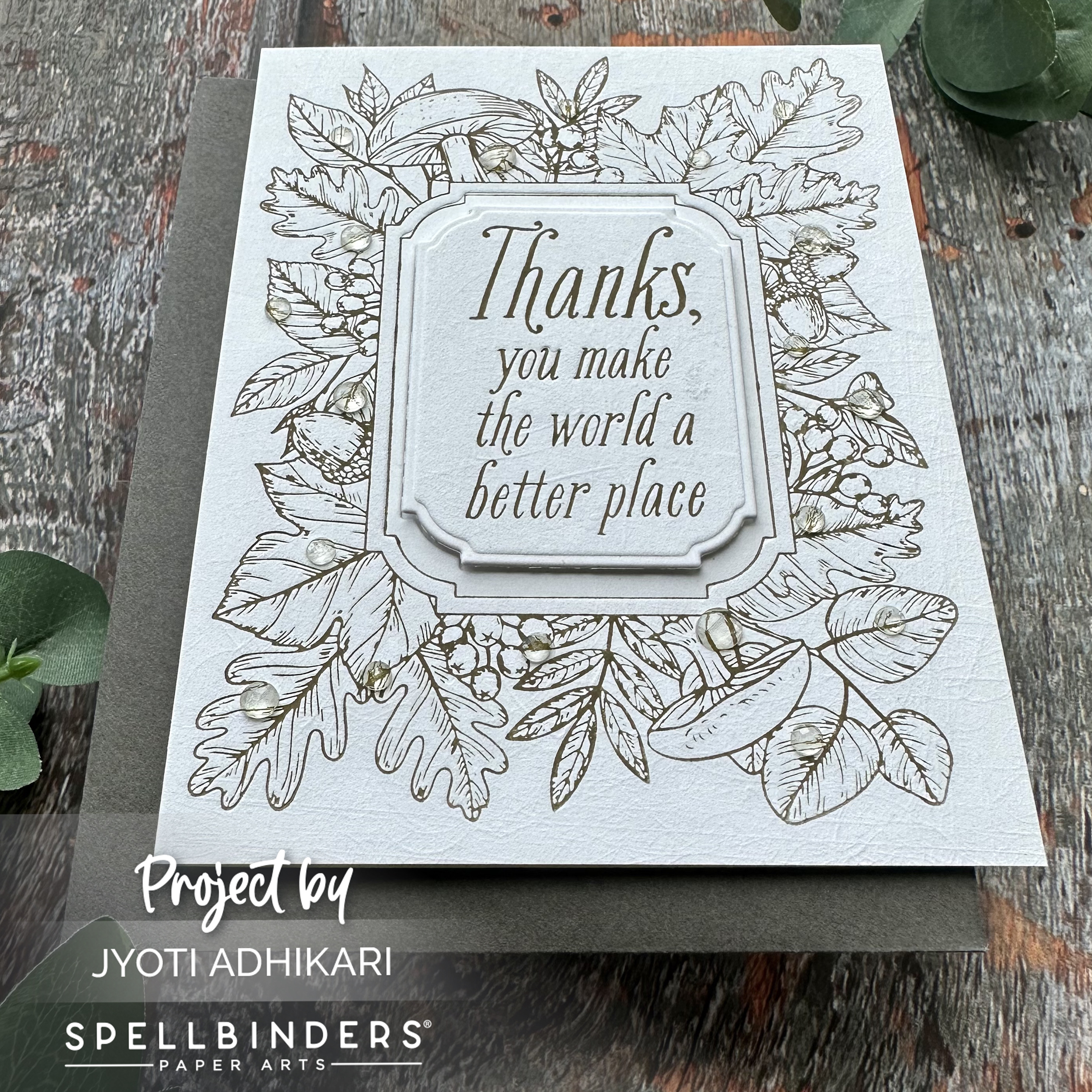
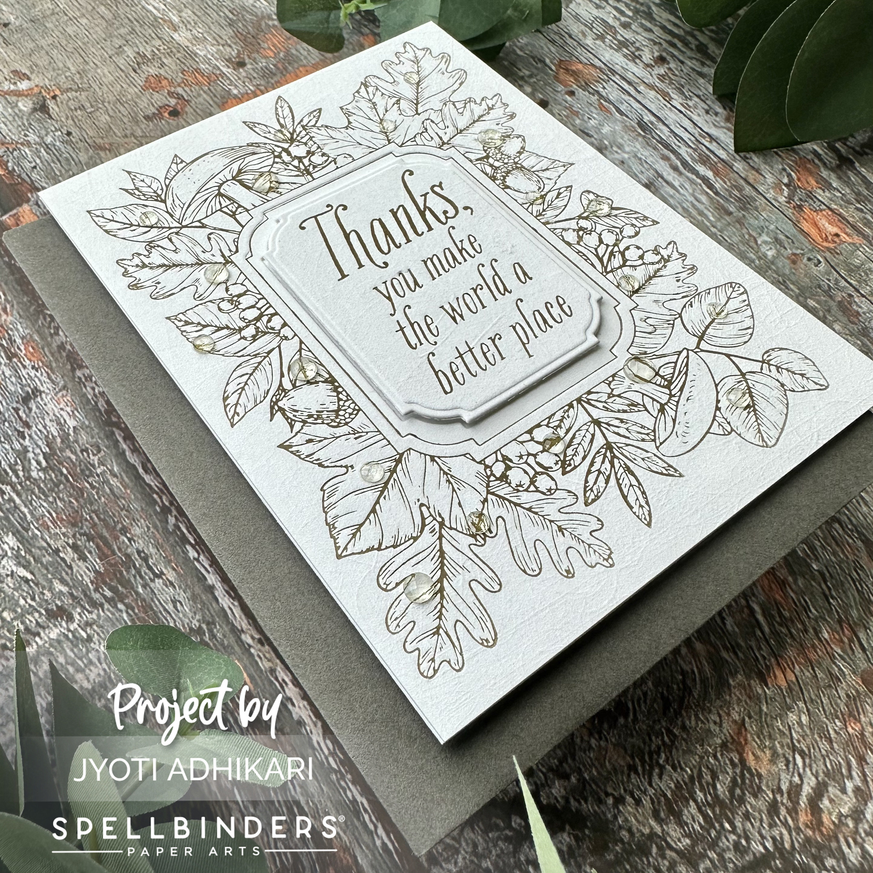
Simply Elegant Fall Frame
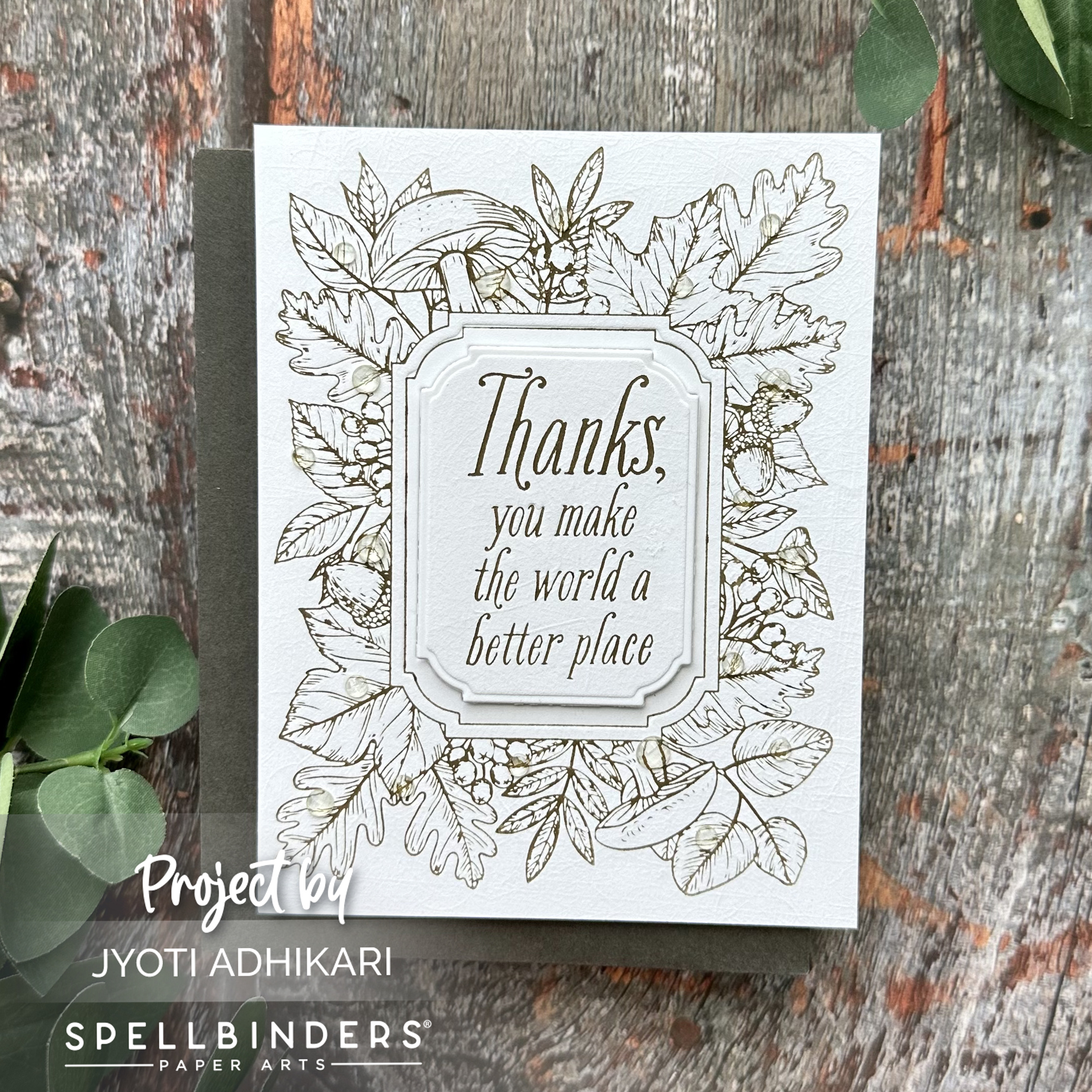
For the third and final card, I let the elegance of autumn speak for itself. Using a PORCELAIN BETTERPRESS A2 COTTON CARD PANEL and green ink, I allowed the border’s intricate design to shine without additional coloring. Sometimes, simplicity is the key to beauty.
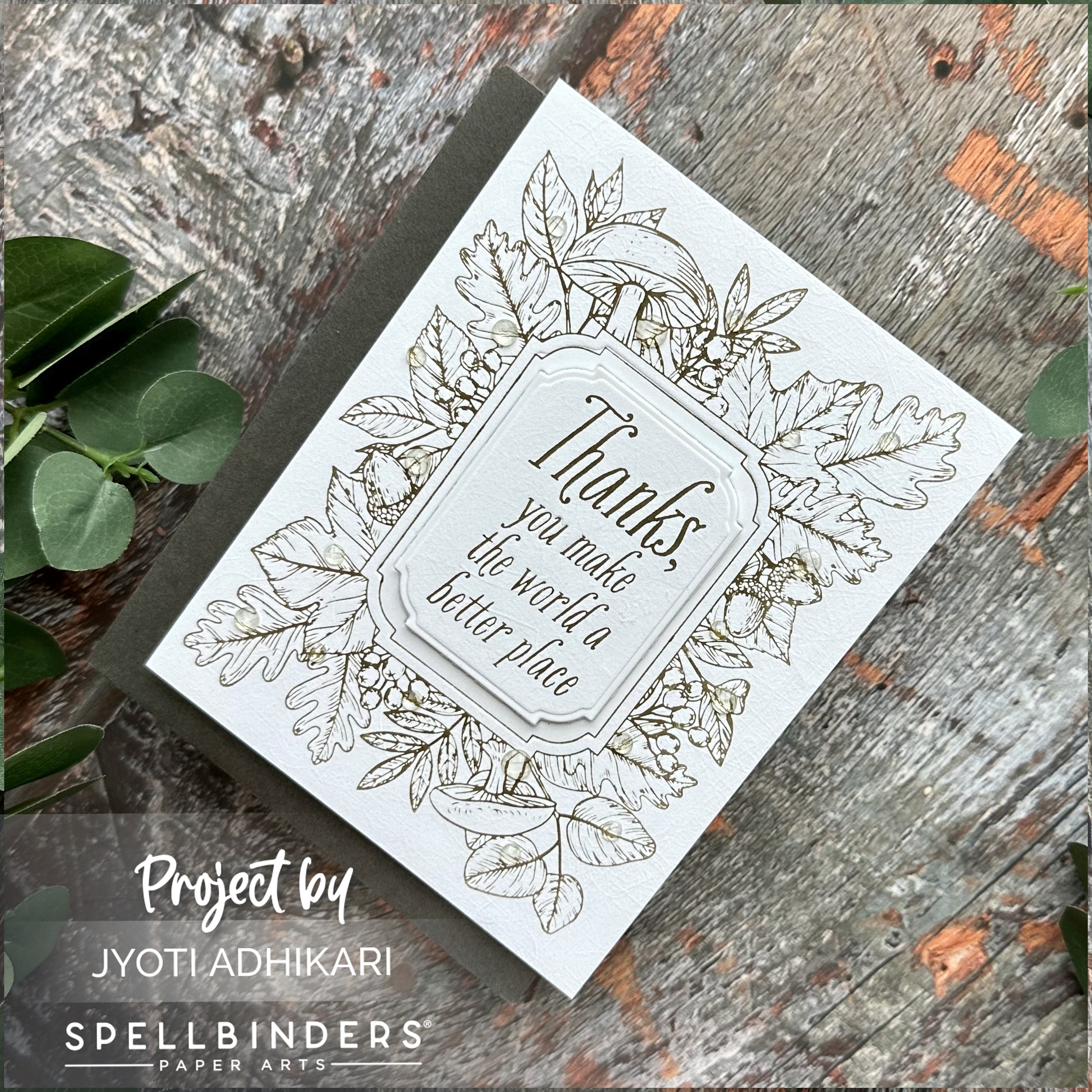
Die cutting the sentiment with the NOTCHED CORNER FRAMES ETCHED DIES, I added it with foam tape for dimension. I embellished it with Studio Katia Sparkling Round Gems, adorning the card with a touch of sparkle and sophistication.
As I look back at these three autumn-inspired cards, I’m reminded that crafting is about embracing the seasons, both in nature and in creativity. With BetterPress, the art of impressions becomes a canvas for endless possibilities, just like the ever-changing colors of fall. So, here’s to celebrating the beauty of autumn one card at a time!
Hugs,